Desktop power. Mobile freedom.
Build the functions with AI, test end to end
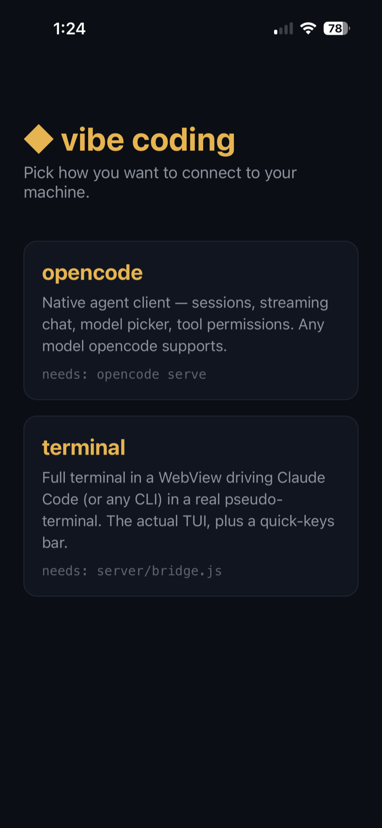
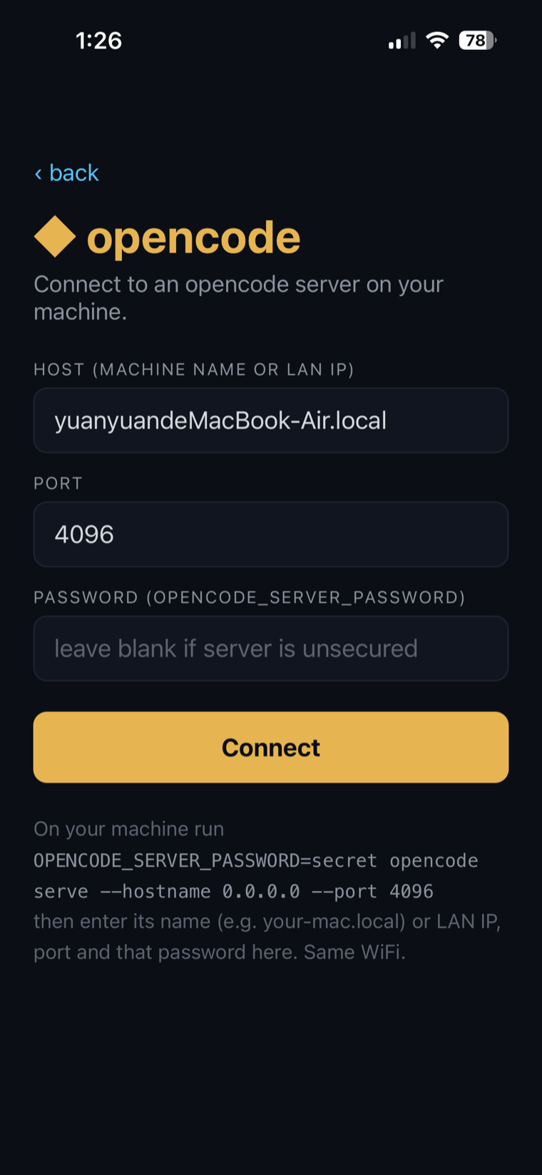
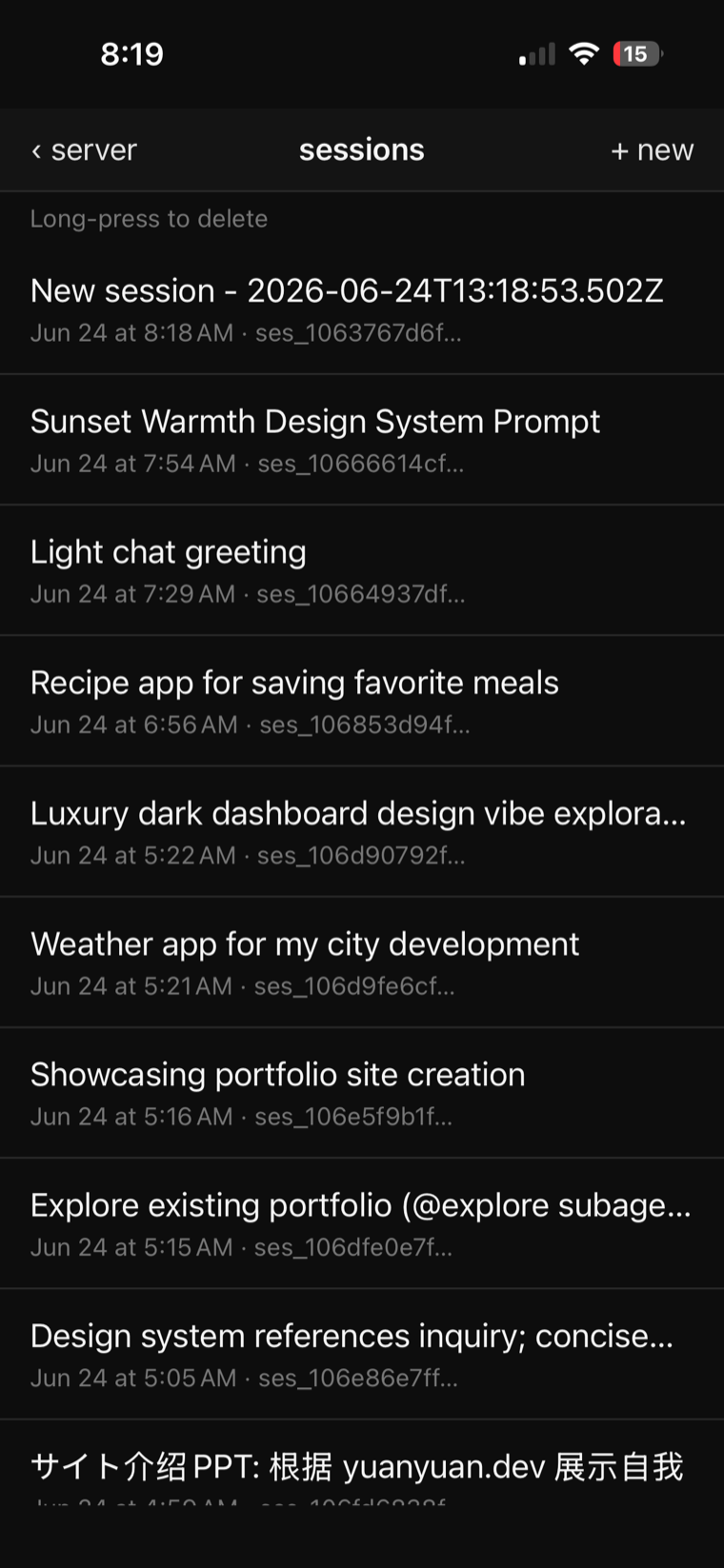
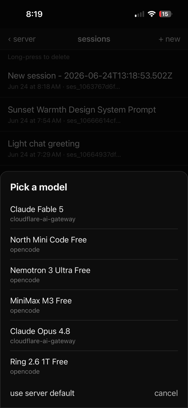
An exported design spec and brand mark — in minutes
# Luxury Dashboard — Design System Prompt

## Overview
High-contrast black and silver with modular card grid

## Color Palette
- Primary (actions, key UI):  #C0C0C0
- On Primary (text/icons):    #0D0D0D
- Secondary:                  #E5E5E5
- Accent (highlights, CTAs):  #FFFFFF
- Background:                 #0D0D0D
- Text:                       #F5F5F5

## Typography
- Heading Font: Space Grotesk
- Body Font:    Inter
- Size Scale:   refined

## Visual Effects
- Subtle Gloss · Card Grid · Serif Accents

## Design Tags
#dark #luxury #professional #elegant #metallic
#finance #dashboard #premium #sophisticated #gray #white

## Implementation Guidelines
Create a modern luxury dashboard design using the palette
above. Apply Space Grotesk for headings and Inter for body
text. Incorporate subtle-gloss as the primary visual effect.
The design should feel dark, luxury, professional, elegant,
metallic, premium, sophisticated — high-contrast black and
silver with a modular card grid.

## Color Usage
- #C0C0C0 — primary actions, buttons, key UI elements
- #0D0D0D — text/icons on primary-colored elements
- #E5E5E5 — secondary elements, complementary accents
- #FFFFFF — highlights, hover states, call-to-actions
- #0D0D0D — main background
- #F5F5F5 — all text content

## AI Prompt (copy-paste ready)
Design a luxury dashboard style interface with colors
#C0C0C0, #E5E5E5, and #FFFFFF on #0D0D0D background. Use
Space Grotesk font for headings. Apply subtle-gloss,
card-grid, serif-accents effects. Style: dark, luxury,
professional, elegant, metallic, finance, dashboard,
premium, sophisticated, gray, white.
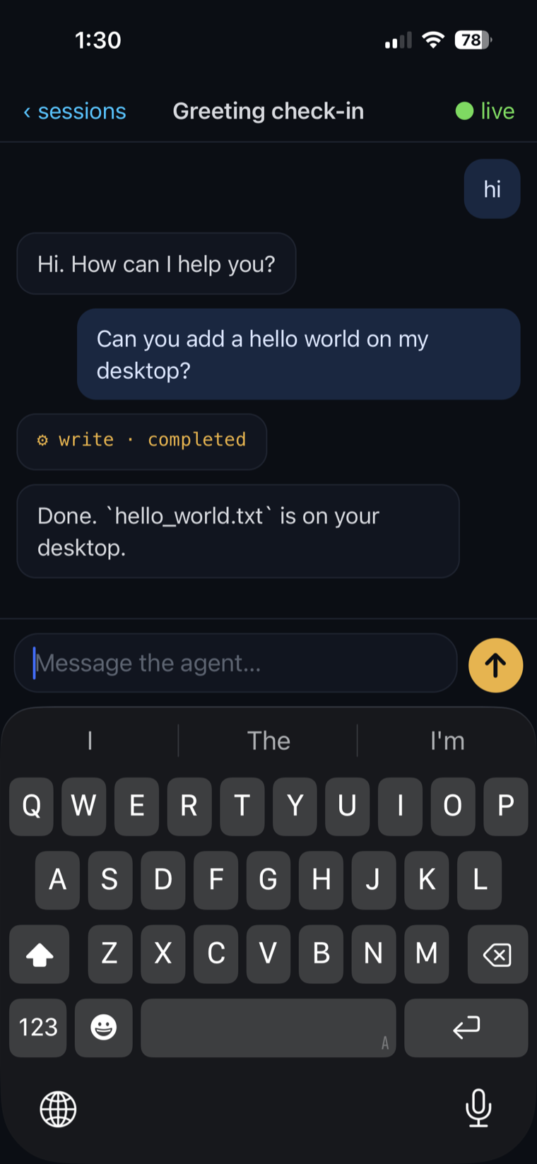
The fast start: a few lines of prompt set the whole visual direction — black & silver, Space Grotesk, contrast-checked tokens — in one pass. Turning it into a real token system and clean code comes later (the slides ahead).
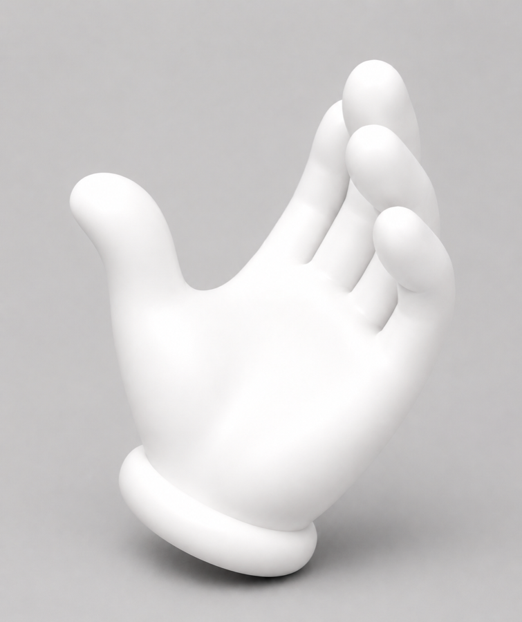
The mark: a hand from image → watertight 3D remesh → Draco → rotates on home.
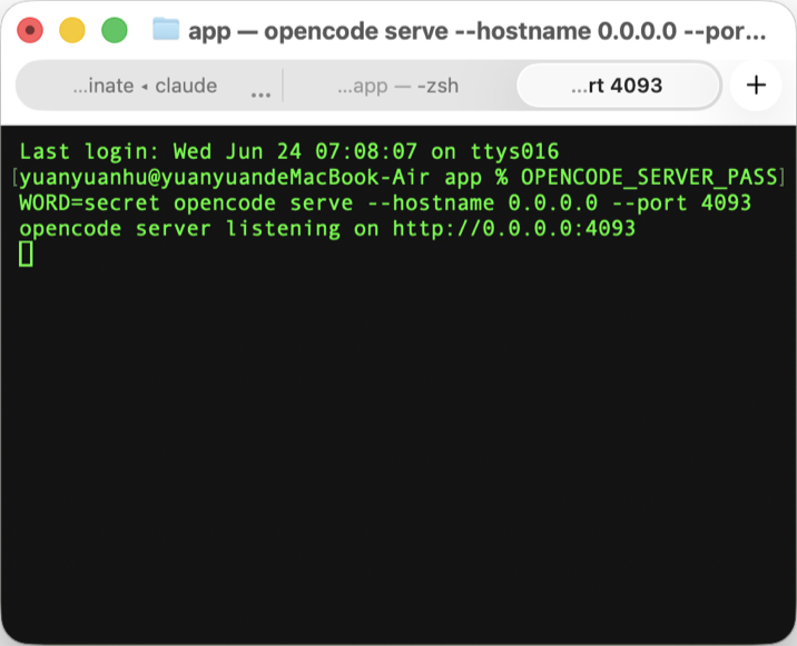
All the server setup, hidden behind one click
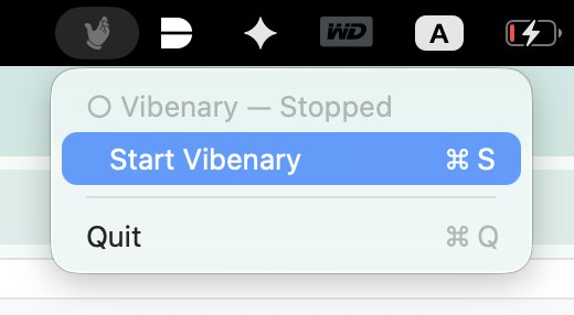
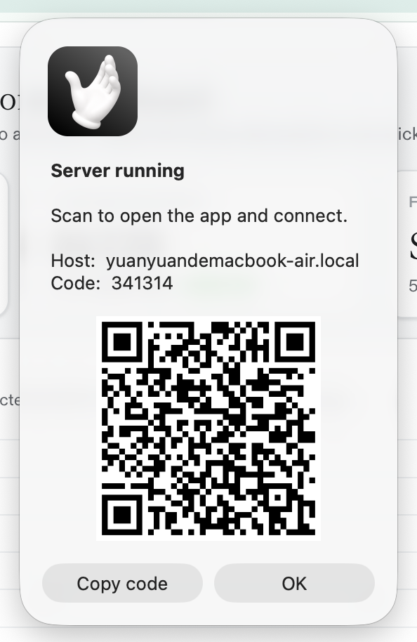
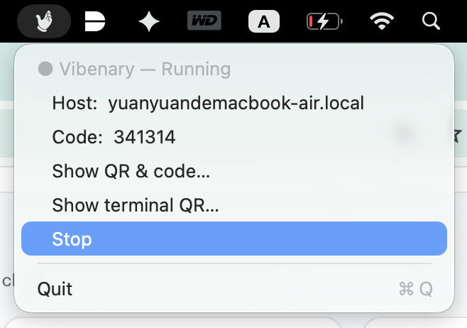
The desktop agent wrapped opencode, the LAN bridge & tokens into a menu-bar app — so setup is just Start, scan, Stop.
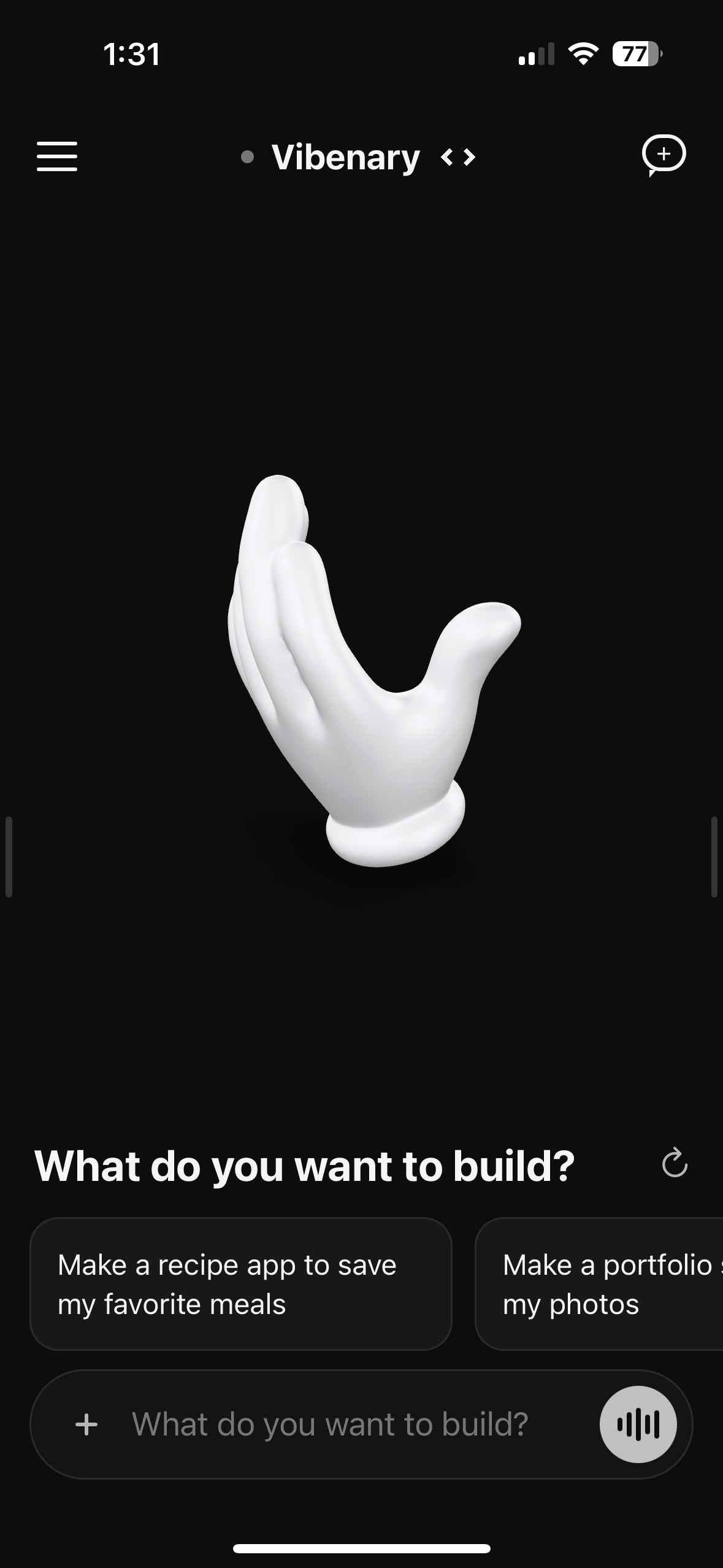
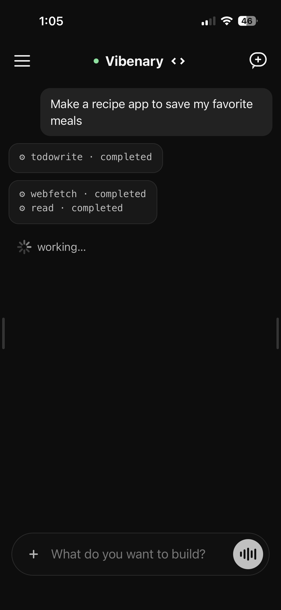
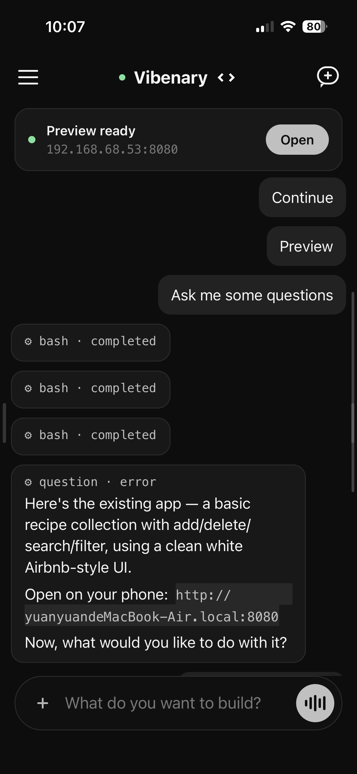
From one sentence to a running, on-brand app
---
version: alpha
name: -design-analysis
description: A warm, generous consumer marketplace anchored on a clean white canvas and  Rausch (#ff385c), the single brand voltage that carries every primary CTA, search-button orb, and rating dot. Type runs  Cereal VF at modest weights — display sits at 22–28px in weight 500/600 rather than the heavy 700+ that fintech and enterprise systems use; the brand trusts photography and generous whitespace over typographic muscle. Three product entries (Homes, Experiences, Services) sit in the top nav with hand-illustrated 32-icon glyphs and "NEW" badges, signaling a marketplace expansion rather than a feature dump. Pill-shaped search bars (`{rounded.full}`), softly rounded property cards (`{rounded.lg}` ~14px), and 32px button radii read as friendly and human — there is no hard corner anywhere except the body grid.

colors:
  primary: "#ff385c"
  primary-active: "#e00b41"
  primary-disabled: "#ffd1da"
  primary-error-text: "#c13515"
  primary-error-text-hover: "#b32505"
  luxe: "#460479"
  plus: "#92174d"
  ink: "#222222"
  body: "#3f3f3f"
  muted: "#6a6a6a"
  muted-soft: "#929292"
  hairline: "#dddddd"
  hairline-soft: "#ebebeb"
  border-strong: "#c1c1c1"
  canvas: "#ffffff"
  surface-soft: "#f7f7f7"
  surface-card: "#ffffff"
  surface-strong: "#f2f2f2"
  on-primary: "#ffffff"
  on-dark: "#ffffff"
  legal-link: "#428bff"
  star-rating: "#222222"
  scrim: "#000000"

typography:
  display-xl:
    fontFamily: "' Cereal VF', Circular, --system, system-ui, Roboto, 'Helvetica Neue', sans-serif"
    fontSize: 28px
    fontWeight: 700
    lineHeight: 1.43
    letterSpacing: 0
  display-lg:
    fontFamily: "' Cereal VF', Circular, sans-serif"
    fontSize: 22px
    fontWeight: 500
    lineHeight: 1.18
    letterSpacing: -0.44px
  display-md:
    fontFamily: "' Cereal VF', Circular, sans-serif"
    fontSize: 21px
    fontWeight: 700
    lineHeight: 1.43
    letterSpacing: 0
  display-sm:
    fontFamily: "' Cereal VF', Circular, sans-serif"
    fontSize: 20px
    fontWeight: 600
    lineHeight: 1.20
    letterSpacing: -0.18px
  title-md:
    fontFamily: "' Cereal VF', Circular, sans-serif"
    fontSize: 16px
    fontWeight: 600
    lineHeight: 1.25
    letterSpacing: 0
  title-sm:
    fontFamily: "' Cereal VF', Circular, sans-serif"
    fontSize: 16px
    fontWeight: 500
    lineHeight: 1.25
    letterSpacing: 0
  rating-display:
    fontFamily: "' Cereal VF', Circular, sans-serif"
    fontSize: 64px
    fontWeight: 700
    lineHeight: 1.1
    letterSpacing: -1px
  body-md:
    fontFamily: "' Cereal VF', Circular, sans-serif"
    fontSize: 16px
    fontWeight: 400
    lineHeight: 1.5
    letterSpacing: 0
  body-sm:
    fontFamily: "' Cereal VF', Circular, sans-serif"
    fontSize: 14px
    fontWeight: 400
    lineHeight: 1.43
    letterSpacing: 0
  caption:
    fontFamily: "' Cereal VF', Circular, sans-serif"
    fontSize: 14px
    fontWeight: 500
    lineHeight: 1.29
    letterSpacing: 0
  caption-sm:
    fontFamily: "' Cereal VF', Circular, sans-serif"
    fontSize: 13px
    fontWeight: 400
    lineHeight: 1.23
    letterSpacing: 0
  badge:
    fontFamily: "' Cereal VF', Circular, sans-serif"
    fontSize: 11px
    fontWeight: 600
    lineHeight: 1.18
    letterSpacing: 0
  micro-label:
    fontFamily: "' Cereal VF', Circular, sans-serif"
    fontSize: 12px
    fontWeight: 700
    lineHeight: 1.33
    letterSpacing: 0
  uppercase-tag:
    fontFamily: "' Cereal VF', Circular, sans-serif"
    fontSize: 8px
    fontWeight: 700
    lineHeight: 1.25
    letterSpacing: 0.32px
    textTransform: uppercase
  button-md:
    fontFamily: "' Cereal VF', Circular, sans-serif"
    fontSize: 16px
    fontWeight: 500
    lineHeight: 1.25
    letterSpacing: 0
  button-sm:
    fontFamily: "' Cereal VF', Circular, sans-serif"
    fontSize: 14px
    fontWeight: 500
    lineHeight: 1.29
    letterSpacing: 0
  link:
    fontFamily: "' Cereal VF', Circular, sans-serif"
    fontSize: 14px
    fontWeight: 400
    lineHeight: 1.43
    letterSpacing: 0
  nav-link:
    fontFamily: "' Cereal VF', Circular, sans-serif"
    fontSize: 16px
    fontWeight: 600
    lineHeight: 1.25
    letterSpacing: 0

rounded:
  none: 0px
  xs: 4px
  sm: 8px
  md: 14px
  lg: 20px
  xl: 32px
  full: 9999px

spacing:
  xxs: 2px
  xs: 4px
  sm: 8px
  md: 12px
  base: 16px
  lg: 24px
  xl: 32px
  xxl: 48px
  section: 64px

components:
  button-primary:
    backgroundColor: "{colors.primary}"
    textColor: "{colors.on-primary}"
    typography: "{typography.button-md}"
    rounded: "{rounded.sm}"
    padding: 14px 24px
    height: 48px
  button-primary-active:
    backgroundColor: "{colors.primary-active}"
    textColor: "{colors.on-primary}"
    rounded: "{rounded.sm}"
  button-primary-disabled:
    backgroundColor: "{colors.primary-disabled}"
    textColor: "{colors.on-primary}"
    rounded: "{rounded.sm}"
  button-secondary:
    backgroundColor: "{colors.canvas}"
    textColor: "{colors.ink}"
    typography: "{typography.button-md}"
    rounded: "{rounded.sm}"
    padding: 13px 23px
    height: 48px
  button-tertiary-text:
    backgroundColor: transparent
    textColor: "{colors.ink}"
    typography: "{typography.button-md}"
  button-pill-rausch:
    backgroundColor: "{colors.primary}"
    textColor: "{colors.on-primary}"
    typography: "{typography.button-sm}"
    rounded: "{rounded.full}"
    padding: 10px 20px
  search-orb:
    backgroundColor: "{colors.primary}"
    textColor: "{colors.on-primary}"
    rounded: "{rounded.full}"
    height: 48px
  icon-button-circle:
    backgroundColor: "{colors.surface-strong}"
    textColor: "{colors.ink}"
    rounded: "{rounded.full}"
    height: 32px
  icon-button-outline:
    backgroundColor: "{colors.canvas}"
    textColor: "{colors.ink}"
    rounded: "{rounded.full}"
    height: 40px
  top-nav:
    backgroundColor: "{colors.canvas}"
    textColor: "{colors.ink}"
    typography: "{typography.nav-link}"
    height: 80px
  product-tab-active:
    backgroundColor: transparent
    textColor: "{colors.ink}"
    typography: "{typography.nav-link}"
    rounded: "{rounded.none}"
  product-tab-inactive:
    backgroundColor: transparent
    textColor: "{colors.muted}"
    typography: "{typography.nav-link}"
  search-bar-pill:
    backgroundColor: "{colors.canvas}"
    textColor: "{colors.ink}"
    typography: "{typography.body-sm}"
    rounded: "{rounded.full}"
    padding: 14px 24px
    height: 64px
  search-field-segment:
    backgroundColor: transparent
    textColor: "{colors.ink}"
    typography: "{typography.caption}"
    padding: 8px 24px
  category-strip:
    backgroundColor: "{colors.canvas}"
    textColor: "{colors.muted}"
    typography: "{typography.button-sm}"
  category-tab-active:
    backgroundColor: transparent
    textColor: "{colors.ink}"
    typography: "{typography.button-sm}"
    rounded: "{rounded.none}"
  property-card:
    backgroundColor: "{colors.canvas}"
    textColor: "{colors.ink}"
    typography: "{typography.body-sm}"
    rounded: "{rounded.md}"
  property-card-photo:
    rounded: "{rounded.md}"
  experience-card:
    backgroundColor: "{colors.canvas}"
    textColor: "{colors.ink}"
    typography: "{typography.title-md}"
    rounded: "{rounded.md}"
  city-link-block:
    backgroundColor: transparent
    textColor: "{colors.ink}"
    typography: "{typography.title-sm}"
  rating-display-card:
    backgroundColor: transparent
    textColor: "{colors.ink}"
    typography: "{typography.rating-display}"
  guest-favorite-badge:
    backgroundColor: "{colors.canvas}"
    textColor: "{colors.ink}"
    typography: "{typography.badge}"
    rounded: "{rounded.full}"
    padding: 4px 10px
  new-tag:
    backgroundColor: "{colors.canvas}"
    textColor: "{colors.ink}"
    typography: "{typography.uppercase-tag}"
    rounded: "{rounded.full}"
    padding: 2px 6px
  amenity-row:
    backgroundColor: transparent
    textColor: "{colors.ink}"
    typography: "{typography.body-md}"
    padding: 12px 0
  reviews-card:
    backgroundColor: transparent
    textColor: "{colors.ink}"
    typography: "{typography.body-sm}"
  host-card:
    backgroundColor: "{colors.canvas}"
    textColor: "{colors.ink}"
    typography: "{typography.body-sm}"
    rounded: "{rounded.md}"
    padding: 24px
  reservation-card:
    backgroundColor: "{colors.canvas}"
    textColor: "{colors.ink}"
    typography: "{typography.body-md}"
    rounded: "{rounded.md}"
    padding: 24px
  date-picker-day:
    backgroundColor: transparent
    textColor: "{colors.ink}"
    typography: "{typography.body-sm}"
    rounded: "{rounded.full}"
  date-picker-day-selected:
    backgroundColor: "{colors.ink}"
    textColor: "{colors.on-dark}"
    rounded: "{rounded.full}"
  text-input:
    backgroundColor: "{colors.canvas}"
    textColor: "{colors.ink}"
    typography: "{typography.body-md}"
    rounded: "{rounded.sm}"
    padding: 14px 12px
    height: 56px
  footer-light:
    backgroundColor: "{colors.canvas}"
    textColor: "{colors.ink}"
    typography: "{typography.body-sm}"
    padding: 48px 80px
  footer-link:
    backgroundColor: transparent
    textColor: "{colors.ink}"
    typography: "{typography.body-sm}"
  legal-band:
    backgroundColor: "{colors.canvas}"
    textColor: "{colors.muted}"
    typography: "{typography.caption-sm}"
---

## Overview

 is the canonical example of a generous, photography-led consumer marketplace. The base canvas is **pure white** (`{colors.canvas}` — #ffffff) with deep near-black ink (`{colors.ink}` — #222222) for headlines and body, and a single voltage of **Rausch** (`{colors.primary}` — #ff385c) carrying every primary CTA, the search-button orb, the heart save state, and inline brand links. There is no secondary brand color in mainline marketing — the **Luxe purple** (`{colors.luxe}` — #460479) and **Plus magenta** (`{colors.plus}` — #92174d) tokens are sub-brand accents that only appear inside  Luxe / Plus contexts.

Type runs ** Cereal VF** (a custom variable font  licenses), with **Circular** as the historic in-house fallback and a system stack underneath. Cereal sits at modest weights — display headlines render at 22–28px in weight 500–600, not the heavy 700+ weights that financial or enterprise systems lean on. The hero h1 ("Inspiration for future getaways") on the homepage is just 28px / 700, which would feel small on a typical SaaS page; here it works because the layout leans on photography (city collage, property cards) for visual weight rather than typographic muscle.

The shape language is **soft**. Buttons are 8px radius (`{rounded.sm}`), property cards are ~14px (`{rounded.md}`), the search bar is fully pill-shaped (`{rounded.full}`), wishlist hearts and search orbs are circles (`{rounded.full}`), and category strip rounded corners run at 32px (`{rounded.xl}`). There is essentially no hard corner anywhere except the body grid itself — every interactive element is rounded.

**Key Characteristics:**
- Single accent color: `{colors.primary}` (#ff385c — "Rausch") carries every primary CTA, the search orb, the heart save state, and the brand wordmark. Used scarcely — most pages are 90% white + ink with one or two Rausch moments.
- Custom variable type: ` Cereal VF`. Display weights sit at 500–700, body at 400. Modest weight is intentional — the system trusts photography for visual heft.
- Three-product top nav: Homes, Experiences, Services — each with a hand-illustrated 32px icon and "NEW" badges (`{component.new-tag}`) on the two newer products. Active tab uses an underline rule (`{component.product-tab-active}`).
- Pill-shaped global search bar: white surface, fully rounded (`{rounded.full}`), divided by 1px hairlines into Where / When / Who segments, terminated by a circular Rausch search orb (`{component.search-orb}`).
- Property cards are photo-first: aspect-ratio rectangles with `{rounded.md}` corner clipping, swipeable image carousel, "Guest favorite" floating badge top-left, heart icon top-right, then 4–5 lines of  beneath.
- Editorial dropdowns (footer, language picker) are clean text columns over the white canvas — no card surface, no shadow.
- The design system caps elevation at one shadow tier (`box-shadow: rgba(0,0,0,0.02) 0 0 0 1px, rgba(0,0,0,0.04) 0 2px 6px, rgba(0,0,0,0.1) 0 4px 8px`) — used on hover-floated cards and search/account dropdowns.
- 8px base spacing system, with major sections at `{spacing.section}` (64px) — generous but not airy enough to feel editorial-magazine; the marketplace density wants more cards per scroll.

## Colors

### Brand & Accent
- **Rausch** (`{colors.primary}` — #ff385c): The single brand color. Used for primary CTA backgrounds (Reserve, Continue), the search orb, the heart save state on property cards, and inline brand links. The most recognizable color in consumer travel.
- **Rausch Active** (`{colors.primary-active}` — #e00b41): The press / pointer-down variant — slightly more saturated. Used on `{component.button-primary-active}`.
- **Rausch Disabled** (`{colors.primary-disabled}` — #ffd1da): A pale tint used on disabled CTAs.
- **Luxe Purple** (`{colors.luxe}` — #460479): Sub-brand accent for  Luxe. Only appears inside Luxe-branded surfaces — never in mainline marketing.
- **Plus Magenta** (`{colors.plus}` — #92174d): Sub-brand accent for  Plus. Same scoping as Luxe — sub-product only.

### Surface
- **Canvas** (`{colors.canvas}` — #ffffff): The default page floor for every public page.  does not have a dark mode on the public web.
- **Surface Soft** (`{colors.surface-soft}` — #f7f7f7): The lightest fill — used on disabled fields, sub-nav hover backgrounds, and the inline search filter band.
- **Surface Strong** (`{colors.surface-strong}` — #f2f2f2): Slightly heavier fill — circular icon-button surface (e.g., the breadcrumb back-arrow and listing toolbar buttons).

### Hairlines & Borders
- **Hairline** (`{colors.hairline}` — #dddddd): The default 1px border tone — search bar dividers, table separators, footer column splitters, card 1px borders.
- **Hairline Soft** (`{colors.hairline-soft}` — #ebebeb): A lighter divider used on long-scrolling editorial body separators.
- **Border Strong** (`{colors.border-strong}` — #c1c1c1): A heavier stroke used on disabled outline buttons and form input outlines after focus.

### Text
- **Ink** (`{colors.ink}` — #222222): The dominant text color on light surfaces. Display headlines, body paragraphs, primary nav links, and most inline link text. Never pure black.
- **Body** (`{colors.body}` — #3f3f3f): A secondary running-text color used inside long-form review and amenity copy where ink would feel too heavy.
- **Muted** (`{colors.muted}` — #6a6a6a): Sub-titles inside city link blocks ("Cottage rentals", "Villa rentals"), inactive product-tab labels, footer category sub-labels, "View all" links.
- **Muted Soft** (`{colors.muted-soft}` — #929292): Disabled link text. Used very sparingly.
- **Star Rating** (`{colors.star-rating}` — #222222): The same ink token — 's star icon and "4.81" rating numbers all render in ink rather than a yellow/gold color, which is a deliberate brand choice (yellow stars feel cheap in travel context).
- **On Primary** (`{colors.on-primary}` — #ffffff): White text on Rausch CTAs.

### Semantic
- **Error** (`{colors.primary-error-text}` — #c13515): Inline error text for form validation. Distinct from Rausch — slightly darker, more saturated red.
- **Error Hover** (`{colors.primary-error-text-hover}` — #b32505): Darkens on link hover.
- **Legal Link Blue** (`{colors.legal-link}` — #428bff): Inline links inside legal copy (Privacy, Terms). Only used inside the legal sub-band.

### Scrim
- **Scrim** (`{colors.scrim}` — #000000 at 50% opacity): The global modal backdrop tone — date picker, login dialog, language picker. Stored as the base hex; opacity is applied at render time.

## Typography

### Font Family
The system runs ** Cereal VF** for everything — display, body, navigation, captions, microcopy. Fallbacks walk `Circular, --system, system-ui, Roboto, "Helvetica Neue", sans-serif`. **Circular** is the historic in-house typeface still kept as the first non-variable fallback; system stacks back it up.

There is no separate display family. The variable font carries the entire scale.

### Hierarchy

| Token | Size | Weight | Line Height | Letter Spacing | Use |
|---|---|---|---|---|---|
| `{typography.rating-display}` | 64px | 700 | 1.1 | -1px | Listing detail rating display ("4.81") |
| `{typography.display-xl}` | 28px | 700 | 1.43 | 0 | Homepage h1 ("Inspiration for future getaways") |
| `{typography.display-lg}` | 22px | 500 | 1.18 | -0.44px | Listing detail h1 ("Close to Fethiye Aliyah Bali Beach…") |
| `{typography.display-md}` | 21px | 700 | 1.43 | 0 | Section heads inside listing detail ("What this place offers") |
| `{typography.display-sm}` | 20px | 600 | 1.20 | -0.18px | Sub-section titles ("Things to know") |
| `{typography.title-md}` | 16px | 600 | 1.25 | 0 | City link block titles ("Wilmington", "Athens") |
| `{typography.title-sm}` | 16px | 500 | 1.25 | 0 | Footer column heads ("Support", "Hosting", "") |
| `{typography.body-md}` | 16px | 400 | 1.5 | 0 | Default running-text inside listing copy |
| `{typography.body-sm}` | 14px | 400 | 1.43 | 0 | Card  lines, dates, prices, distance text |
| `{typography.caption}` | 14px | 500 | 1.29 | 0 | Search field segment labels ("Where", "When", "Who") |
| `{typography.caption-sm}` | 13px | 400 | 1.23 | 0 | Footer legal line ("© 2026 , Inc.") |
| `{typography.badge}` | 11px | 600 | 1.18 | 0 | "Guest favorite" floating badge text |
| `{typography.micro-label}` | 12px | 700 | 1.33 | 0 | Card amenity micro-labels ("Inline 6") |
| `{typography.uppercase-tag}` | 8px | 700 | 1.25 | 0.32px (uppercase) | "NEW" badge on product nav tabs |
| `{typography.button-md}` | 16px | 500 | 1.25 | 0 | Primary CTA button labels |
| `{typography.button-sm}` | 14px | 500 | 1.29 | 0 | Pill button labels (category strip) |
| `{typography.link}` | 14px | 400 | 1.43 | 0 | Inline body links |
| `{typography.nav-link}` | 16px | 600 | 1.25 | 0 | Top product-nav labels (Homes, Experiences, Services) |

### Principles
Display weights stay modest. The homepage h1 at 28px / 700 is deliberately small — it tucks under the search bar so photography and the city-link grid carry visual hierarchy. The listing-detail h1 at 22px / 500 is even quieter; the listing photo banner does the work above it.

The single typographically loud moment in the entire system is the **rating display** (`{typography.rating-display}` — 64px / 700) on listing pages. That is the only place the system trusts type alone to carry hierarchy — rating numbers are a peak trust signal, so they get the loudest treatment.

### Note on Font Substitutes
If  Cereal VF and Circular are unavailable, **Inter** is the closest open-source substitute. Adjust display headlines down by ~2% in line-height to match Cereal's slightly tighter cap height; otherwise the proportions transfer cleanly.

## Layout

### Spacing System
- **Base unit:** 4px (with 2px micro-step).
- **Tokens:** `{spacing.xxs}` 2px · `{spacing.xs}` 4px · `{spacing.sm}` 8px · `{spacing.md}` 12px · `{spacing.base}` 16px · `{spacing.lg}` 24px · `{spacing.xl}` 32px · `{spacing.xxl}` 48px · `{spacing.section}` 64px.
- **Section padding (vertical):** `{spacing.section}` (64px) for major page bands; tighter than typical SaaS marketing (80–96px) because marketplace pages need higher card density per scroll.
- **Card internal padding:** `{spacing.lg}` (24px) for `{component.host-card}` and `{component.reservation-card}`; `{spacing.base}` (16px) for property-card  block; `{spacing.sm}` (8px) for caption / date-row gutters.
- **Gutters:** `{spacing.base}` (16px) between cards in the homepage city grid; `{spacing.lg}` (24px) inside footer column gutters; `{spacing.xs}` (4px) on dense category-strip dividers.

### Grid & Container
- **Max content width:** ~1280px centered on the homepage and editorial pages. Listing detail pages cap closer to 1080px to keep the photo banner and reservation rail readable.
- **City link grid (homepage footer):** 6-column grid at desktop with each cell housing a city name in `{typography.title-md}` and a category sub-label in `{typography.body-sm}` muted.
- **Listing detail:** 2-column with photo / amenity body on the left (~64% width) and a sticky reservation card (`{component.reservation-card}`) on the right (~32%).
- **Footer:** 3-column link list (Support / Hosting / ) at desktop, collapsing to 1-column on mobile.

### Whitespace Philosophy
The system gives editorial bands 64px of vertical breathing room but compresses card grids — property and city-link cards sit just 16px apart. The contrast is intentional: the page reads as "open hero, dense marketplace below," reinforcing the marketplace nature without overwhelming the visitor at the fold.

## Elevation

The system has essentially **one shadow tier** plus the flat baseline.

- **Flat (no shadow):** Body, hero, footer, all editorial bands — 95% of surfaces.
- **Card hover float:** `box-shadow: rgba(0, 0, 0, 0.02) 0 0 0 1px, rgba(0, 0, 0, 0.04) 0 2px 6px 0, rgba(0, 0, 0, 0.1) 0 4px 8px 0` — applied to property cards on pointer hover, the search bar at rest, and the dropdown menus (account menu, language picker, date picker). This is the single shadow definition in the entire system.
- **Modal scrim:** `{colors.scrim}` rendered at 50% opacity — the global modal backdrop. Used on date pickers, login dialogs, language picker.

There are no progressive elevation tiers — the system either has the one shadow or none. Depth comes from photography, the white-on-white surface separation, and rounded-corner clipping rather than from layered shadows.

## Components

### Buttons

**`button-primary`** — Rausch fill, white text, 8px radius, 14×24px padding, 48px height, weight 500. The most common CTA across the system: "Reserve", "Continue", "Search", account-flow primaries.

**`button-primary-active`** — The press state. Background flips to `{colors.primary-active}`. No transform, no shadow change.

**`button-primary-disabled`** — Pale Rausch tint at #ffd1da with white text.  not-allowed.

**`button-secondary`** — White fill with ink text and a 1px ink outline. 8px radius. Used for "Save", "Cancel", and inverse CTAs over Rausch surfaces.

**`button-tertiary-text`** — Plain ink text, no surface, no border. Underlined on hover. Used for "Show more" type links and modal close labels.

**`button-pill-rausch`** — A pill-shaped Rausch CTA used on featured cells (e.g., "Become a host" sub-CTA) — 9999px radius, 10×20px padding, 14px label.

### Search Surface

**`search-bar-pill`** — The signature global search bar. White fill, 9999px radius, 64px height, 1px hairline 1px-shadow border. Internally divided by vertical hairline rules into `{component.search-field-segment}` cells (Where / When / Who). Each segment holds an uppercase caption label above a placeholder line in `{typography.caption}`.

**`search-orb`** — The circular Rausch orb terminating the right edge of the search bar. 48×48px, fully rounded, white magnifying-glass icon centered. The hottest single color moment on the homepage.

### Top Navigation

**`top-nav`** — White surface, 80px height, 1px bottom hairline. The  wordmark sits flush left, the three product tabs (Homes / Experiences / Services) sit in the dead center, and account utilities (host link, language globe, account menu) sit flush right.

**`product-tab-active`** — Ink label in `{typography.nav-link}`, 32px hand-illustrated icon, 2px ink underline rule beneath the icon-label pair.

**`product-tab-inactive`** — Muted label, illustrated icon, no underline. Becomes active on click.

**`new-tag`** — A tiny rounded-pill badge (`{rounded.full}`) anchored top-right of an icon, carrying the uppercase "NEW" label in `{typography.uppercase-tag}` (8px / 700 with 0.32px tracking, uppercase). Used on Experiences and Services to signal recency.

### Listing Cards

**`property-card`** — A photo-first card. 1:1 aspect-ratio image with `{rounded.md}` corner clipping, image carousel dots overlay, "Guest favorite" floating badge top-left (`{component.guest-favorite-badge}`), and a heart icon top-right (`{component.icon-button-circle}` in default outlined state, Rausch-filled when saved). Beneath the image: 4–5 lines of  — title (`{typography.title-md}`), distance / dates (`{typography.body-sm}` muted), and price ("$X night") right-aligned.

**`property-card-photo`** — The photo plate itself, separated as a token because some surfaces (wishlist, search results) reuse just the photo without the  block.

**`experience-card`** — A taller-aspect card (4:5) for experience listings. Same `{rounded.md}` clipping, floating "NEW" badge top-left, heart top-right, and a single-line title beneath.

**`guest-favorite-badge`** — White rounded pill (`{rounded.full}`) at 11px / 600 weight. Sits over the photo with the system's only shadow tier applied for elevation.

### Listing Detail

**`rating-display-card`** — The signature listing-detail moment. A 64px / 700 rating number ("4.81") flanked left and right by tiny laurel-wreath SVG ornaments. Beneath the rating: "Guest favorite" tagline and a row of ink stat columns. The largest typographic weight in the whole system.

**`amenity-row`** — A 1-column list of amenity icons + ink labels in `{typography.body-md}`. 12px row padding, no border between rows; section is closed by a 1px hairline divider above and below.

**`reviews-card`** — A 2-column grid of review excerpts. Each column holds an author row (avatar, name, date) above a 3-line excerpt with "Show more" tertiary link.

**`host-card`** — A white card with `{rounded.md}` rounding and 24px padding holding a host avatar, name, "Superhost" badge, response-rate stat, and a "Contact host" `{component.button-secondary}`.

**`reservation-card`** — The sticky right-rail card on listing detail pages. White surface, `{rounded.md}` rounding, 1px hairline border, 1px shadow tier elevation, 24px padding. Contains: nightly price (`{typography.display-md}` ink), date-range selector, guest-count stepper, "Reserve" primary CTA full-width, and a fee breakdown stack beneath in `{typography.body-sm}`.

### Date Picker

**`date-picker-day`** — A 40×40px circular cell carrying the day number in `{typography.body-sm}`. Default state is transparent fill, ink text.

**`date-picker-day-selected`** — Ink fill, white text, full circle (`{rounded.full}`). Range states between two selected days carry a `{colors.surface-soft}` lozenge background that connects them.

### Forms

**`text-input`** — White surface, 1px hairline outline, `{rounded.sm}` 8px radius, 56px height, 14×12px padding. Stacked label above (in `{typography.caption}` muted), placeholder text in `{typography.body-md}` muted. On focus, the border thickens to 2px ink and the border color flips to `{colors.ink}` — no glow, no ring.

### Footer

**`footer-light`** — White surface (matches the page canvas —  has no contrast footer), 48×80px padding. Three columns of link blocks (Support / Hosting / ), separated by generous 24px gutters. Each column heads with a `{typography.title-sm}` ink label and stacks `{component.footer-link}` rows in `{typography.body-sm}` ink.

**`legal-band`** — A bottom strip beneath the footer columns carrying the copyright line, language picker (globe icon + "English (US)" link), currency picker, and social icons (Facebook, X, Instagram). All text in muted `{colors.muted}` at `{typography.caption-sm}`.

## Responsive Behavior

| Name | Width | Key Changes |
|---|---|---|
| Mobile | < 744px | Top nav collapses to logo + hamburger; product tabs hide behind a sheet; search bar collapses to a single tappable pill; property cards stack 1-up; city grid 1-column; listing detail collapses reservation card to a sticky bottom bar. |
| Tablet | 744–1128px | Top nav keeps product tabs but search bar narrows; property cards 2-up; city grid 2–3 column; reservation card stays sticky right-rail at narrower width. |
| Desktop | 1128–1440px | Full top nav with three product tabs centered; search bar at full pill width with all 3 segments visible; property cards 4-up; city grid 6-column; listing detail 2-column with reservation rail. |
| Wide | > 1440px | Content width caps at 1440px on listing/search pages and ~1280px on editorial; gutters absorb the rest. |

### Touch Targets
- Primary CTAs at minimum 48×48px (above WCAG AAA).
- Search orb is 48×48px circular — the most-tapped element on the page.
- Heart save button is 32×32px circular — borderline for AAA but compensated by a generous 12px padding inside the photo card.
- Date-picker day cells are 40×40px circular.

### Collapsing Strategy
- Top product tabs collapse into a hamburger sheet below 744px.
- Search bar's 3 segments collapse into a single-tap entry that opens a full-screen search overlay on mobile.
- Property and city-link grids drop column counts cleanly at each breakpoint — never reflow rows; always reduce columns.
- Reservation card on listing detail switches from sticky right-rail to a sticky bottom bar on mobile, carrying just the "Reserve" CTA + nightly price summary.

## Known Gaps

- **Hover state colors:** intentionally not documented per the global no-hover policy — 's actual `:hover` styling for property cards is a subtle elevation lift, but precise extraction is unreliable.
- **Loading states / skeleton screens:** not visible on the extracted surfaces.
- **Map view styling:** the search-results map uses Mapbox-tinted tiles with custom Rausch markers; not captured here.
- **Form input error states:** error text color (`{colors.primary-error-text}`) is documented, but the full input outline + helper-text combination on validation failure was not visible in the captured surfaces.
- **Sub-brand palettes:** Luxe (`{colors.luxe}`) and Plus (`{colors.plus}`) are documented as tokens, but their full sub-system (typography overrides, surface treatment) lives on separate sub-domains and is not captured here.
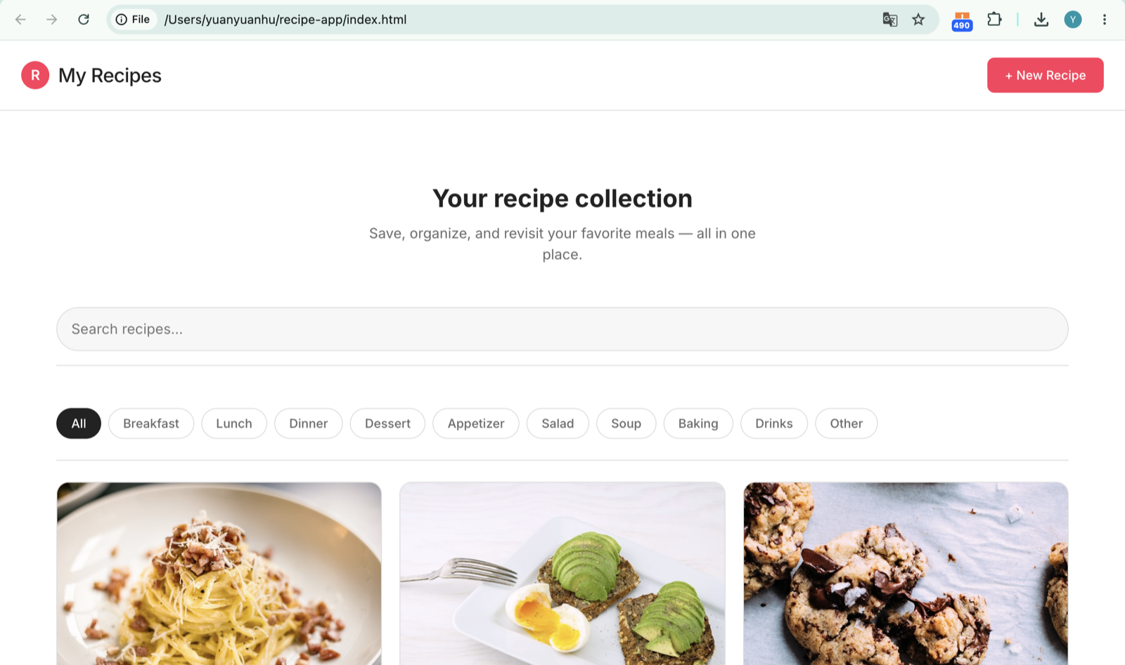
"Make a recipe app to save my favorite meals" — built with content, images & persistence, entirely from the phone.
A native app does what a terminal can't
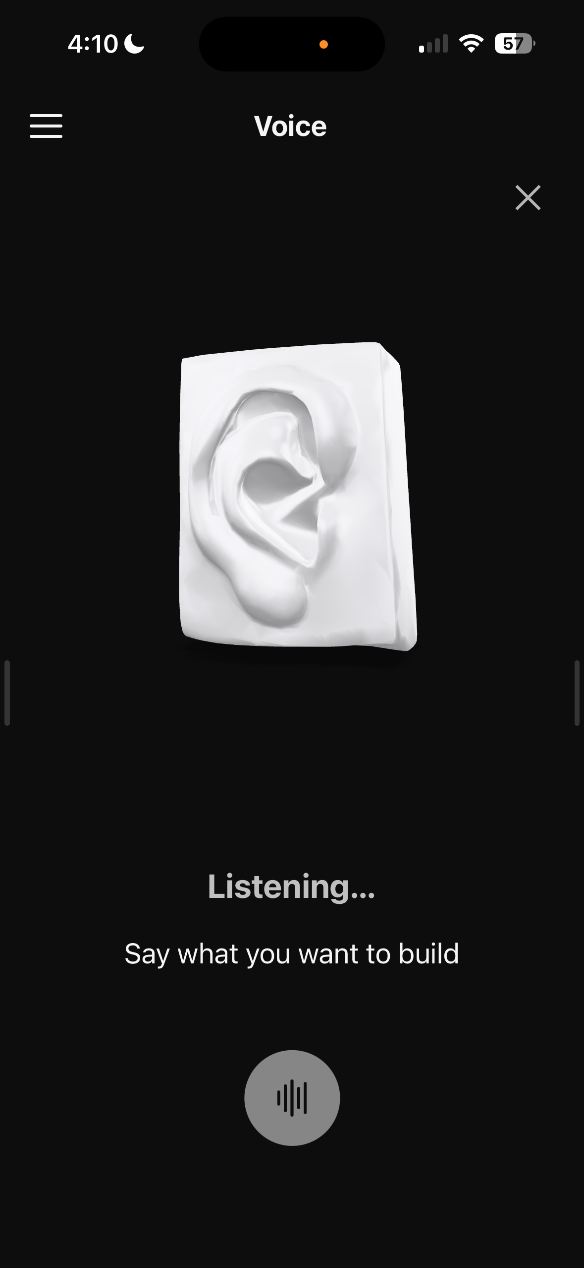
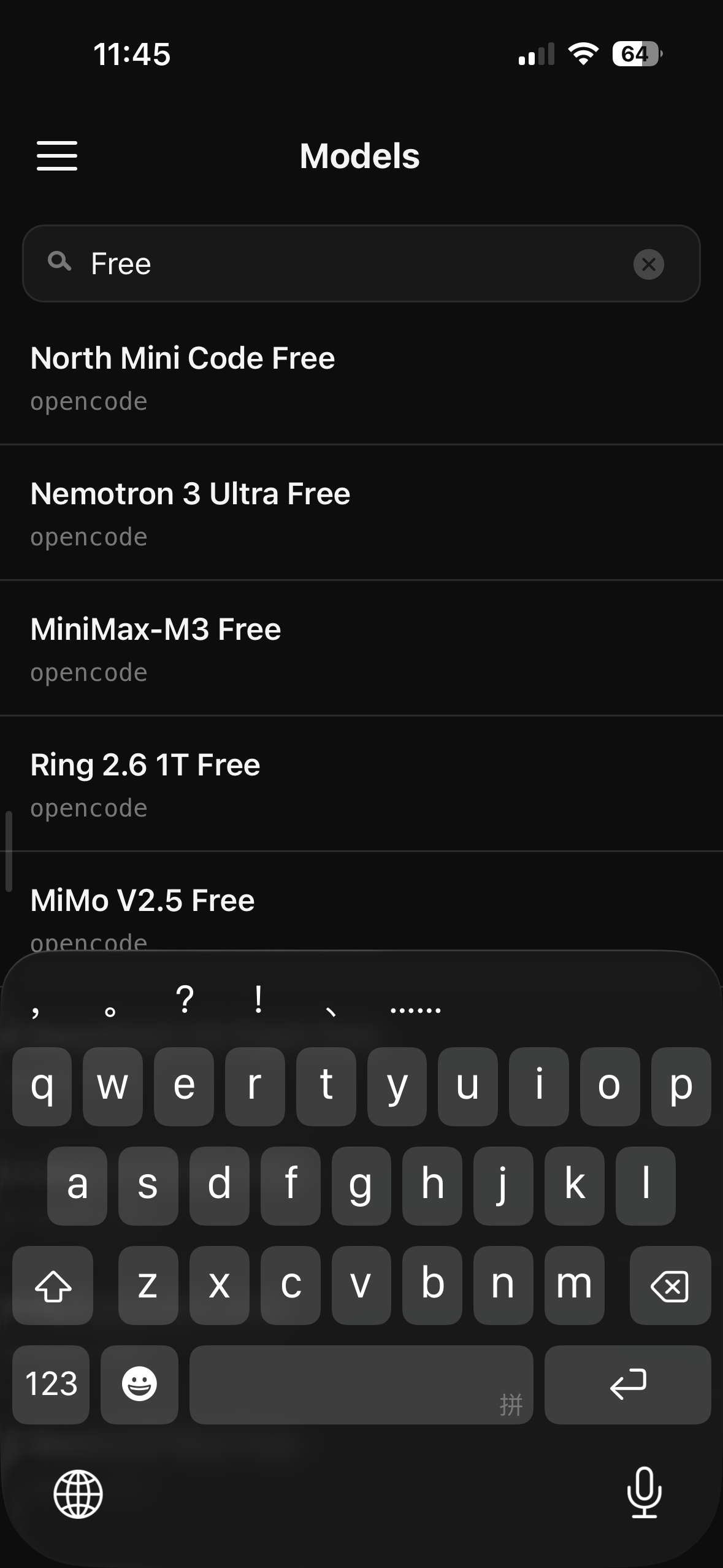
Speak the goal instead of typing it — the 3D mark listens and transcribes live. And reach for any model the agent supports from one searchable list. Native input, any model — things a raw terminal can't touch.
Tune it to how you work
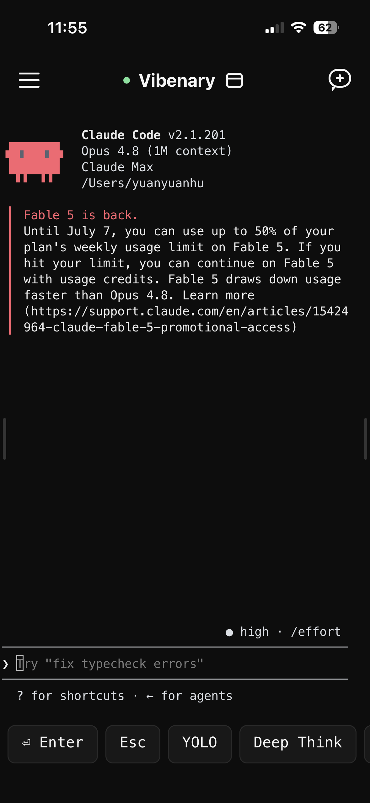
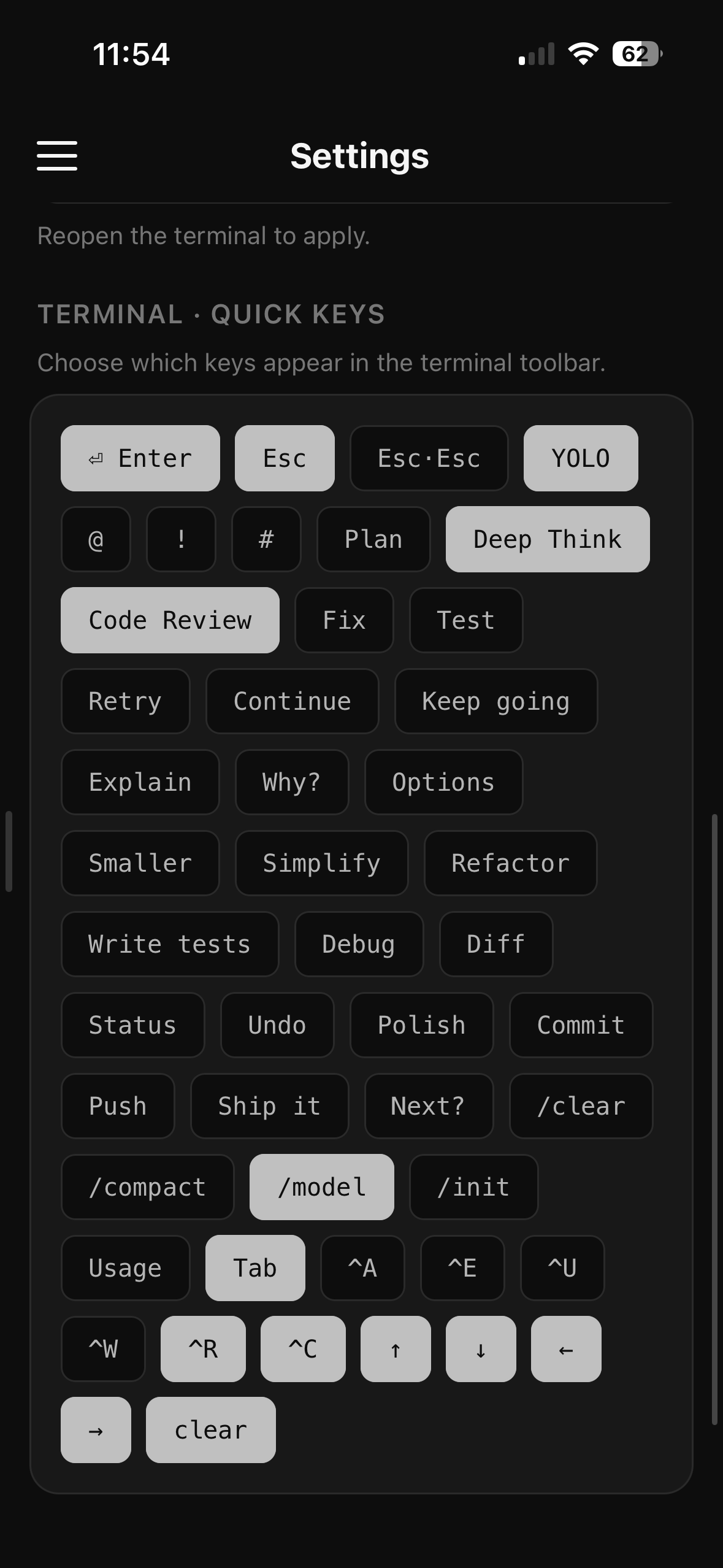
Pick exactly which quick keys live in the terminal toolbar — Plan, Code Review, /model, Deep Think, whatever you reach for most. Bring your own Claude Code, model, and effort level. The tools bend to your workflow, not the other way around.
The agent shows its work
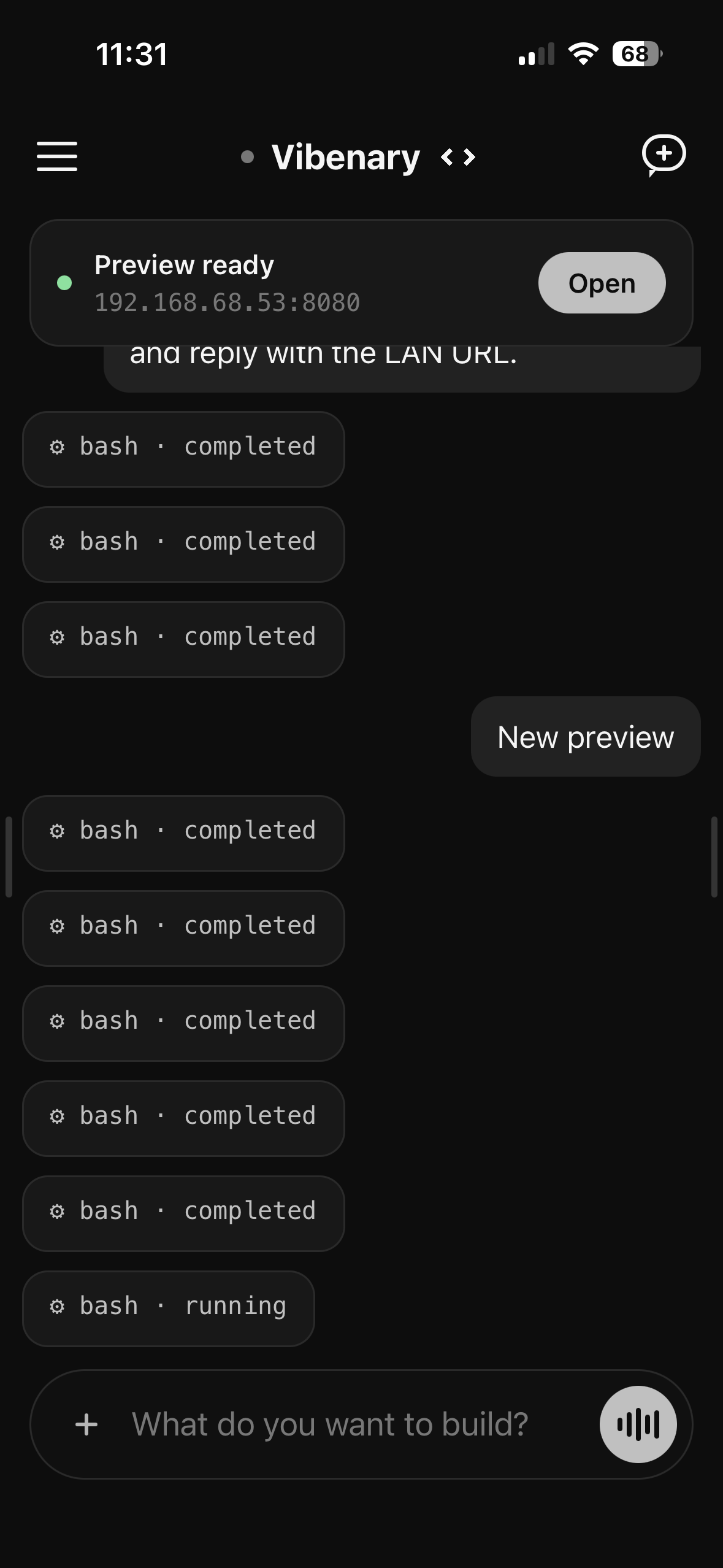
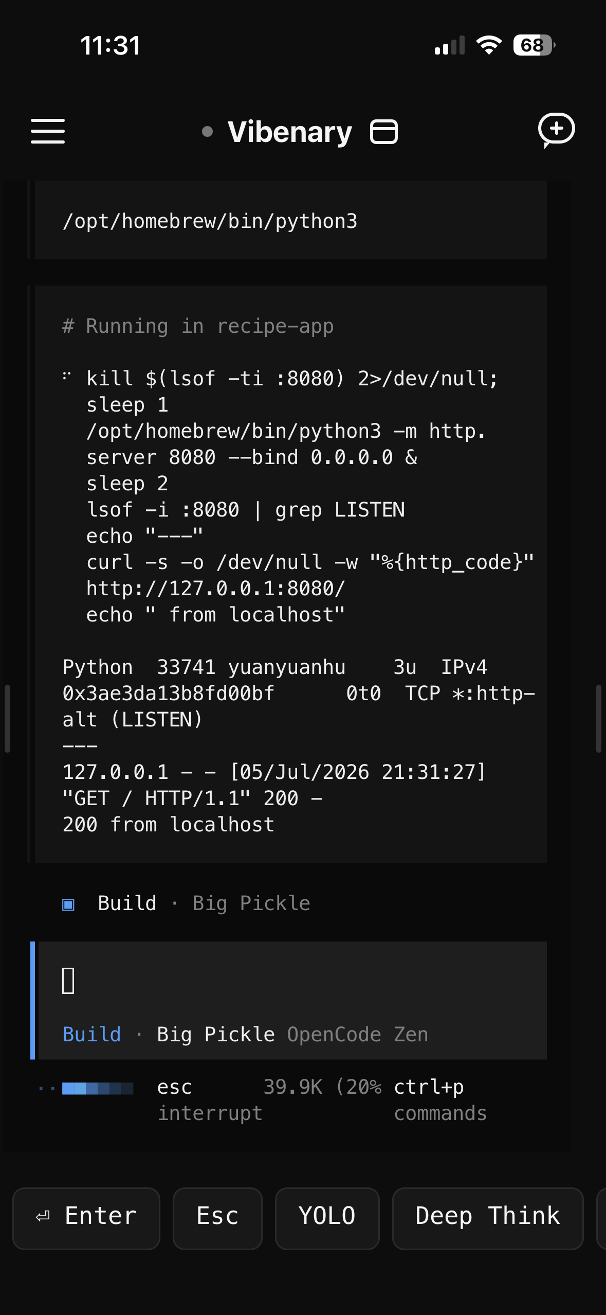
Every step is visible — each action as a tool card in the GUI, the exact commands and raw output in the terminal. It's your machine; nothing runs behind your back.
It comes to you
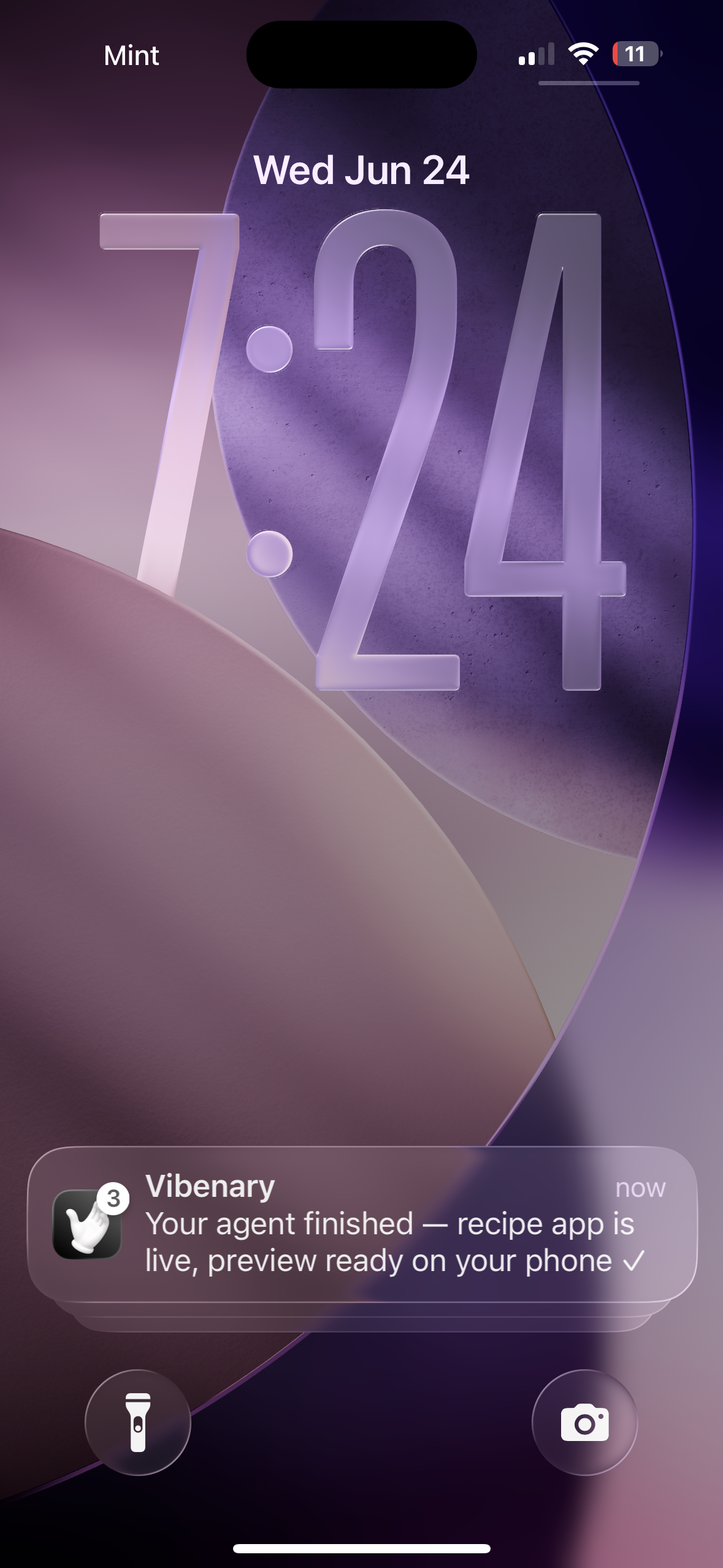
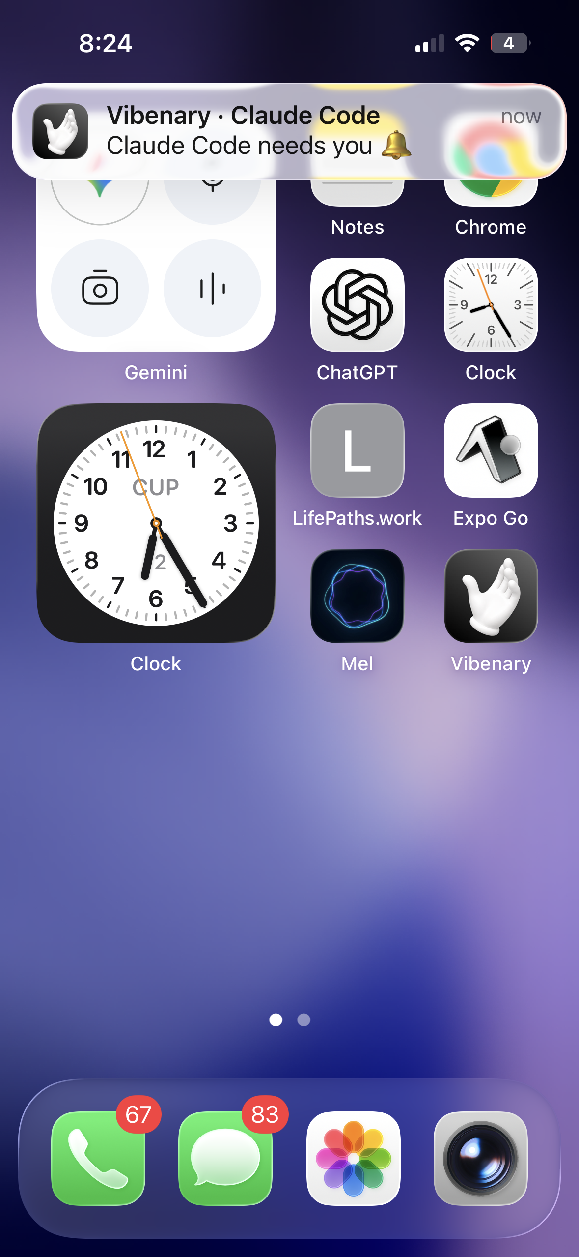
Long agent runs are unpredictable. So Vibenary pings you the moment it needs a decision — or when a build finishes or blocks. Step away; it comes and finds you.